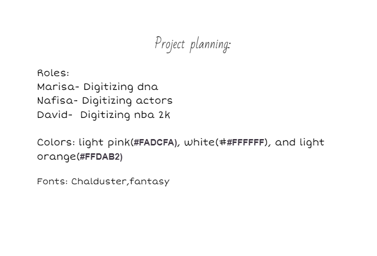
The screenshot above is an image of our first draft planning, and how we wanted our webpage to look like at first. We of course changed the color scheme and the fonts since then, going from pink, white, and orange, to green, white, and black. The font now being Lucida Console rather than Chalduster, Fantasy.
For this project, we wanted to divide up the work up into 3 sections. David would do the article about NBA digitilization, Marisa would do the article about DNA digitilization, and Nafisa would do the article about actor digitilization. Nafisa and Marisa would do the CSS together while David would do the borders. Everyone worked on their own page, and Marisa helped David work on his page.
As a team, we feel the most proud of the final product. We love the colors of the pages, and how everything works nicely together. We also love how we made the font look more "digital" in order to set the mood of the content in the page.
The most difficult aspect of this project was re-copying in our articles and having to use CSS to make it annotated the same way as we have it in our google doc. This was the most time-consuming area of our webpage. The second one would be making the tables, as we had to refer back to our previous labs in order to remember the codes and what each code stands for.